
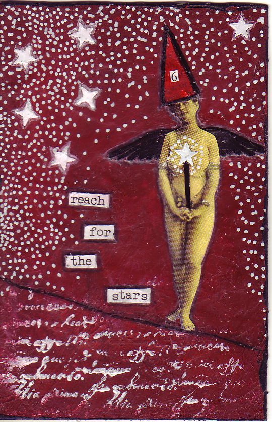
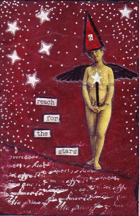
So I've been working on a skinny page for a swap I'm in. Here are the 2 examples of the pages. I'm not sure if I like the one on the left better or the right, so any feedback would be helpful. The only difference between these 2, is that one has more constellations (??) than the other. Like I say, any feedback welcome.
I'm not sure what's going on with my art lately, but the the two times I've been working on a canvas, I have ended up with a red page and a theme of reach for the stars! Not intentionally done, this is just how this page flowed from me. Maybe I need to do it a couple of times more, to make sure that that theme is done with me and then I can move on to the next.
Hope you are all managing to have a great one.
They are both fabulous Nat! I guess the decision is do you want to focus on the goal or the woman reaching for the goal.
ReplyDeleteI love the colour combination and background.
Again, both beautiful! but I think the one with less stars shows the woman more - but I love the red, it's so vibrant. Cheers, Carmel xx
ReplyDeleteHi Nat,
ReplyDeleteLovely painting!! :oD i think i like the one with less stars as it looks more balanced but the one with more stars looks good too. i love the reds! :o)
love
Sulea